Flybear Pick and Pack was launched back in 2021. After just two years, I felt like a rebranding was necessary. Inspiration came after looking at all (not just eCommerce Fulfillment hubs) the beautiful logos out there. We just didn’t stand out.


In a matter of days, I was able to make our logo pop. I made the bear cuter with better colours, and I changed our colour scheme.
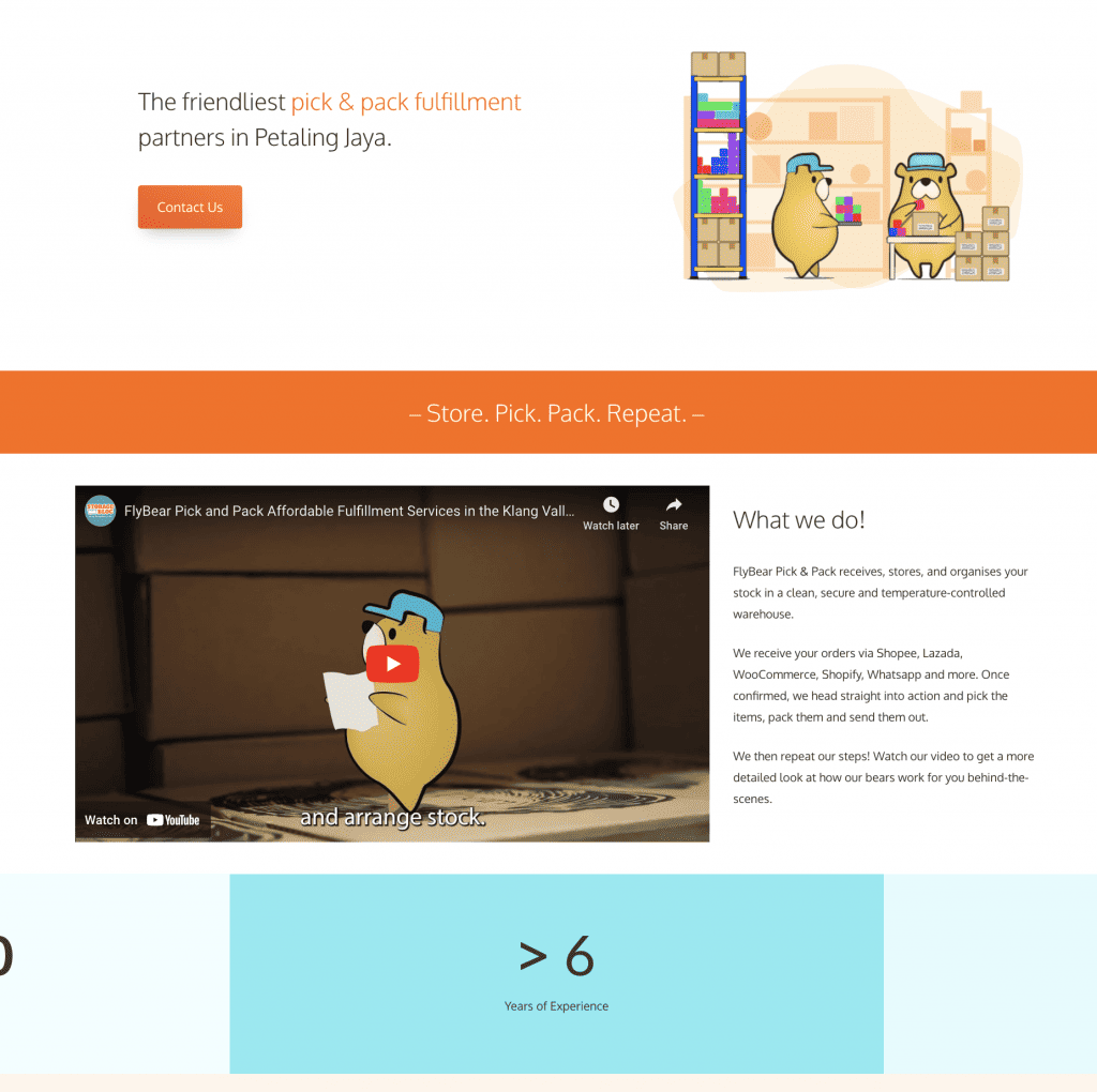
We Upgraded the Flybear Pick and Pack Website!

Was the website bad? No. In fact, we received a lot of compliments for both our website and our logo. However, I didn’t feel like it pushed our achievements nor our vision very well.
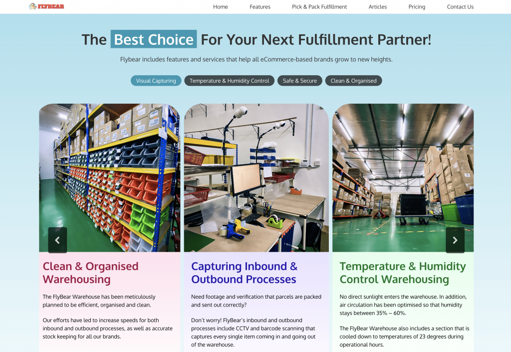
The website increased in value after we chose the right keywords as headlines. I was also adamant on using less-polished photos.

This is our Features page. With just a few words, we tell our story. We’ve also made sure that we link to some of our partners, such as Leap eCommerce.
All-in-all, I am very proud of our new website and logo. It really tells our story well.
Flybear Pick and Pack is here to help you grow by taking care of the day-to-day fulfillment operations, and we will always do our best to make sure you get to greater heights!
